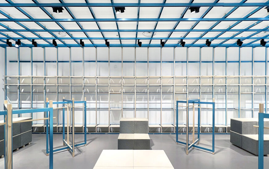
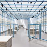
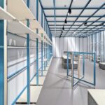
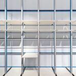
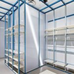
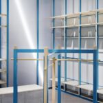
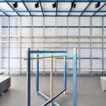
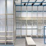
Francesca Perani Enterprise and Bloomscape Architecture joined forces to design the new store for the multi-brand retailer ON-OFF in Milan. Their aim was to experiment with flexible and scalable display solutions borrowed from the construction industry, envisioning a circular future.
Distinctive Spatial Identity
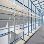
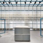
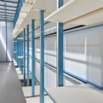
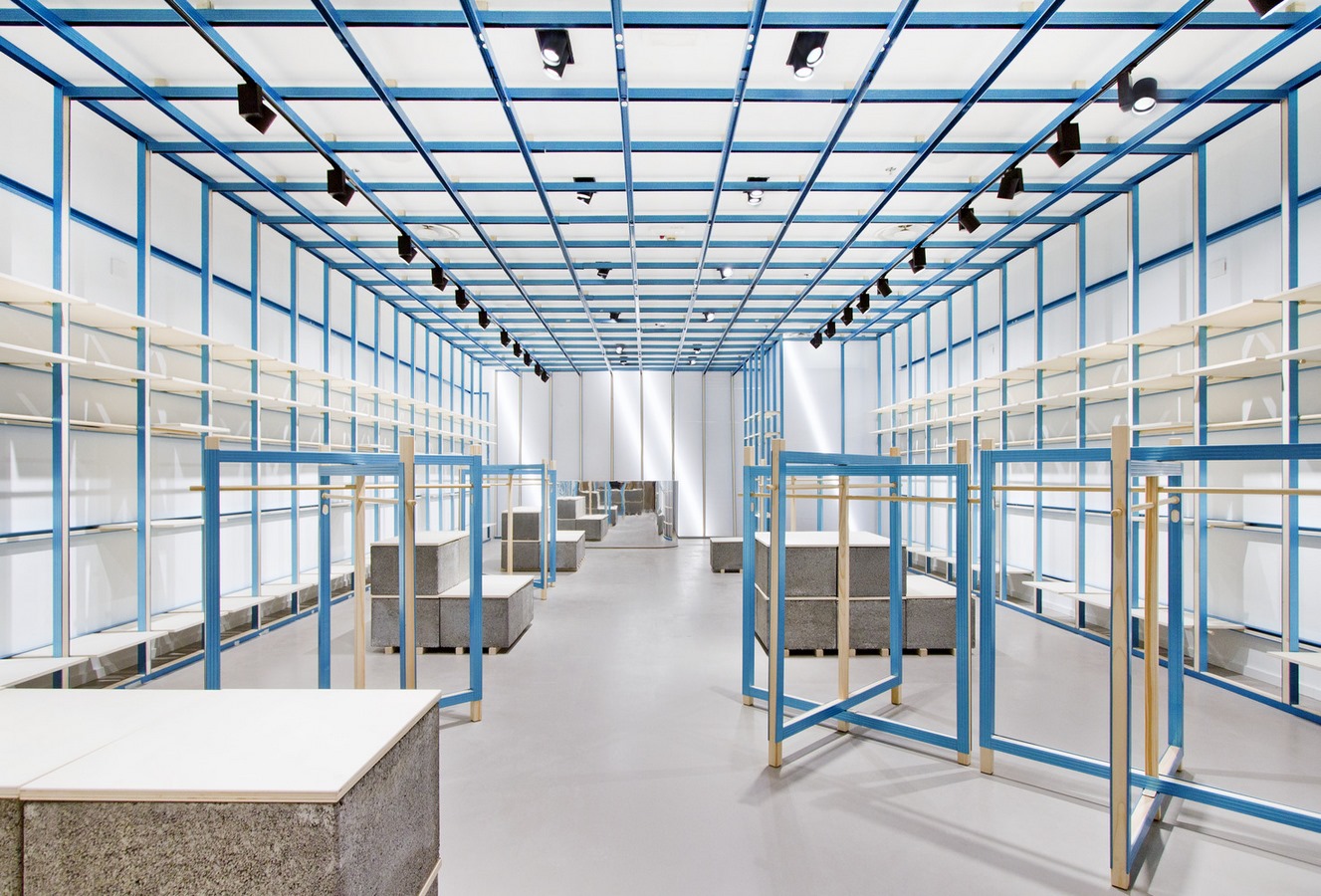
Spanning 100 square meters, the space is characterized by an exposed structure in bright blue, anodized steel drywall framing, and inserts and shelving in poplar wood. This playful fusion of industrial and natural materials in their essential forms defines the spatial identity.
Addressing Time Constraints with Innovative Solutions
In response to time constraints, the design team sought easily available construction solutions to create a new fit-out prototype. Inspired by the construction world, they aimed to minimize waste and enhance existing materials, mindful of sustainability.
Fulfilling Client Expectations
The client’s brief emphasized the creation of a new brand identity within a limited budget. High-flexibility displays were prioritized to facilitate faster store rollout and replication in diverse contexts.
Innovative Design Elements
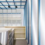
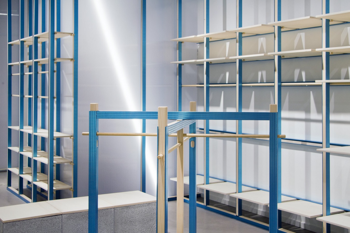
A colored metal grid descends from the ceiling, covering all walls and hosting adjustable shelves and a single wood rail for hanging items. Prefabricated concrete blocks, mirror features, and methacrylate surfaces complete the material palette, with blue protective treatment as a dominant feature.
Spatial Layout and Functionality
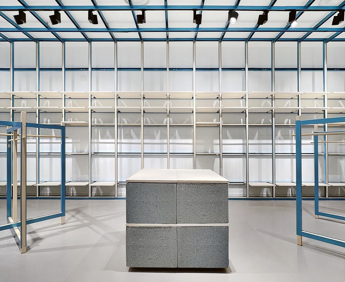
The internal layout features an open distribution of the sales area, with hangable and folded items displayed along the walls. The central area alternates between free-standing displays and focused islands for folded goods, offering flexibility for commercial needs.
Integration of Functional Elements
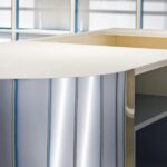
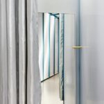
The cash register unit, integrated with mirror finishes, blends seamlessly within the shop, while the dressing rooms utilize light polycarbonate partitions with structural metal and wood frames, ensuring privacy yet maintaining visual continuity.
Seamless Circulation and Brand Communication
Internal circulation is designed to provide a complete depth of vision, with a clear central path and communication panels hanging from the ceiling guiding customers to identify and select brands.
Reversible Design Approach
The shop is conceived as reversible in two ways: it minimizes demolition and reconstruction costs by offering flexibility in developing commercial premises, and it allows for repositioning or recycling of display elements, contributing to sustainability efforts.
Conclusion: A Vision for Contemporary Dynamics
The project embodies a single language strongly connected to materials, expressing contemporary dynamics while addressing waste limitation and the need for access to refined materials.

